Two sofa covers can share a broadly similar color family while suggesting different room stories. One may invite attention to sheen; another may draw attention to a textured surface. Instead of calling one universally lighter or more elegant, describe the visual quality you want to explore in your own room. The comparison becomes more useful when a styling impression is not mistaken for a material-performance test.
Begin with what the maker actually describes
IKEA describes the Alhamn dark-brown velvet on its STOCKHOLM 2025 sectional, article 295.743.14, as having a dense pile and a light-reflective sheen. Its UPPÅKRA corner-sofa listing, article 596.206.68 in Axvall off-white, identifies that cover as bouclé. Those are two specific maker descriptions, rather than an assessment of all velvets and bouclés. The different colors and sofa configurations also prevent treating these two listings as a controlled comparison of texture alone.
Use those descriptions to name the questions for a sample enquiry: sheen, visible texture, actual color and the scale of the surface in the room. This article has not handled either cover or inspected either sofa in person. The maker's text does not establish how a sample will look in your home, how it will feel to you or whether it will tolerate your household routine.
An original room exercise, rather than a winner
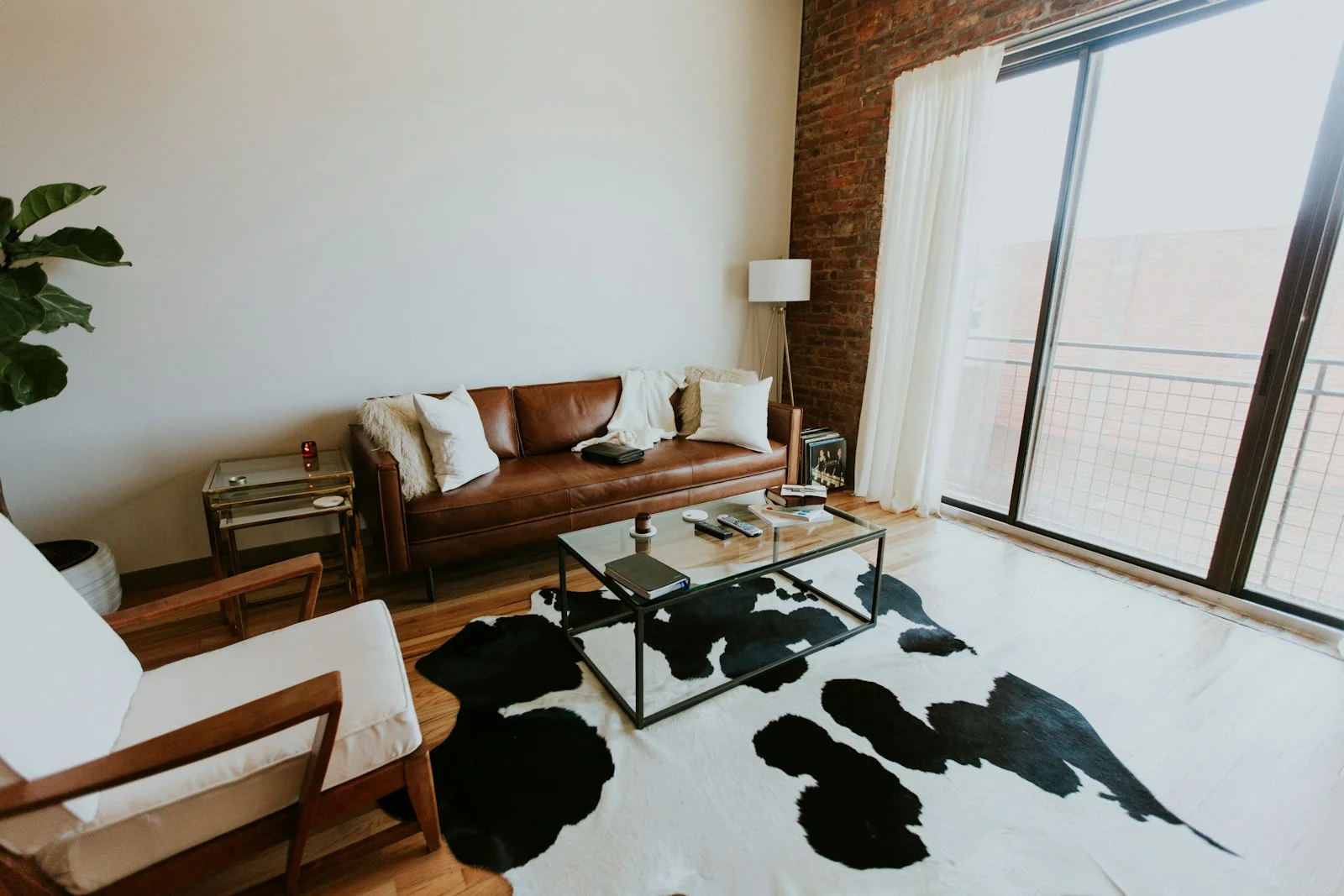
Imagine a hypothetical living room with a patterned rug and a plain wall. In one paper plan, make the sofa the main material accent and leave the surrounding accessories quiet. In a second, make the rug the main accent and keep the sofa choice visually restrained in your own judgment. These are proposed compositions, not measured effects of a particular fabric. Either could suit the person who lives there.
If you can obtain the relevant samples, view them in the intended room and keep notes on what you actually observe. Record the sample identity and where you looked at it. A useful note might say that you prefer the appearance beside your rug, rather than asserting that the material makes every small room look bigger. Do not write a sample observation you have not made.
Give visual weight your own concrete meaning
The phrase visual weight is most useful when you can explain what you mean by it. Are you responding to contrast with the wall, attention drawn to texture, the visible legs or the amount of patterned material already in view? Those are different styling questions. A single adjective such as heavy can hide which part of the arrangement you would actually change.
Try resolving one relationship at a time in the plan. You might keep the existing rug and reconsider the cover, or keep the chosen cover and reduce competing accessories. This exercise does not require replacing every soft furnishing. It can also reveal that the sofa you already own fits the intended composition well enough.
Performance remains another enquiry
Once a cover interests you visually, read its exact care and product information. Cleaning permission, wear performance and comfort require their own evidence; this article establishes none of them from the word bouclé, a sheen description or a product photograph. A pleasant material story can start the shortlist while leaving those questions open.
Keep the final note in two parts: your stated styling preference and the documented practical requirements still to check. The result is a personal choice you can explain without turning it into a ranking of entire fabric families. No fabric was stain-tested, rubbed, washed or used for a claimed room transformation here.
Sources & further reading
Published sources for the details and examples discussed in this story.