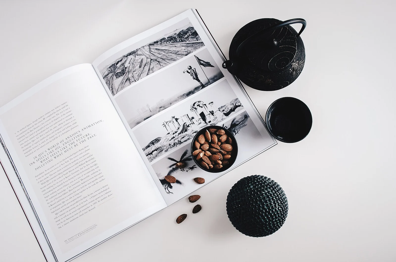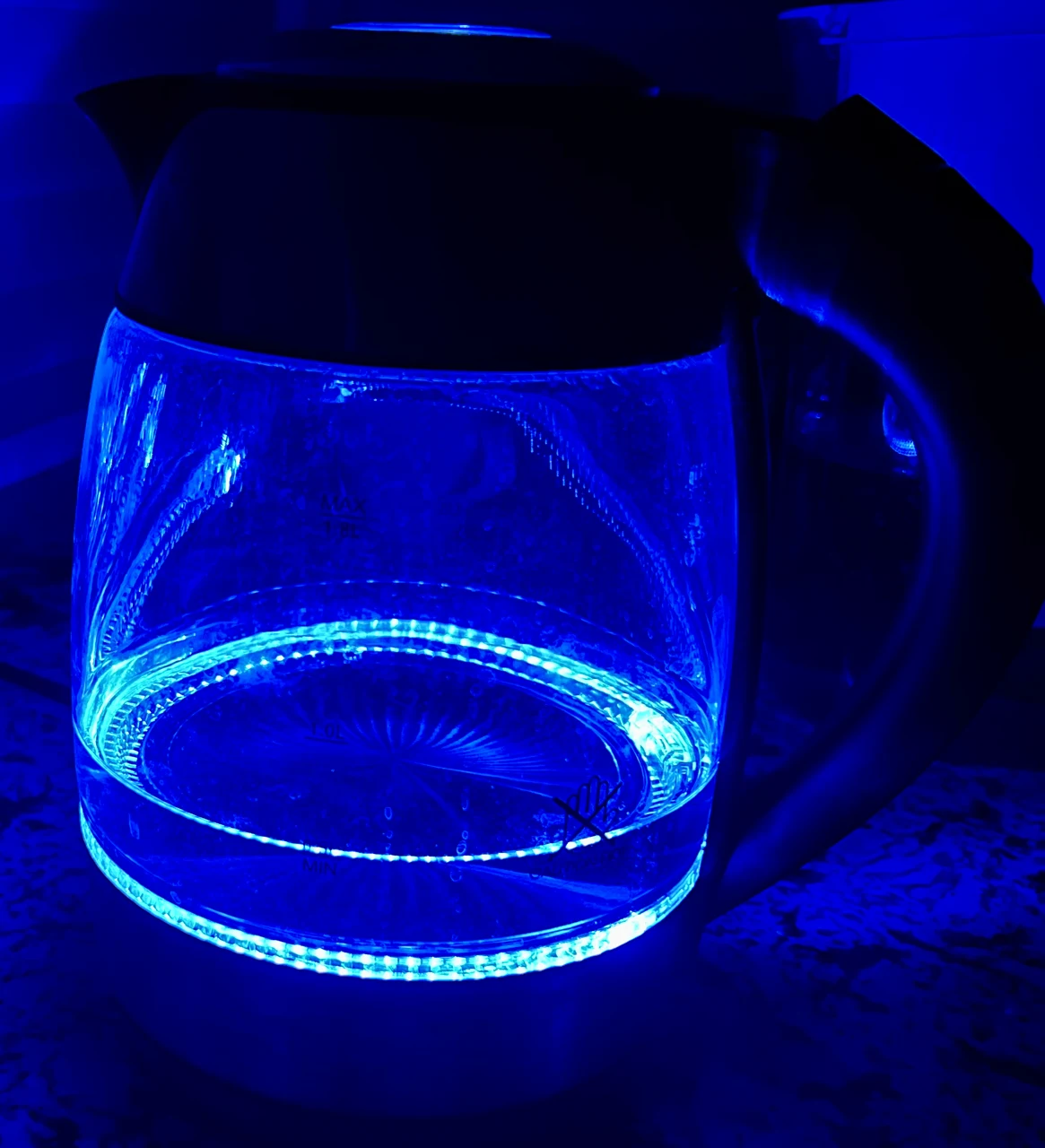
Imagine an open kitchen with a blue kettle already in regular use. The appliance is staying in its suitable, maker-compliant working arrangement; this feature proposes no relocation or electrical setup. From the adjoining room, its blue shape is clearly visible among quieter surfaces. A matching container and cups appear in a shop photograph. Before buying them, ask whether you want the kettle’s color to remain one distinct presence or become part of a repeated set.
One blue object can look intentional on its own
In the first original view, leave the hypothetical counter and kettle exactly as they are. Imagine the ordinary accessories as visually quiet rather than replacing them with blue versions. To my eye, the kettle is a single recognizable shape: its own color belongs to an object with a job. Nothing in that relationship requires the rest of the counter to explain why blue is present.
That is the reason I might decline the matching purchases. It is not that matching objects are inherently excessive, or that the kettle becomes better at its task without them. The preference is for a distinct object rather than a small collection. Buying several related pieces could change that particular relationship instead of completing it.
Repeated blue turns the object into part of a group
For the second imagined view, retain the same kettle, finishes and working arrangement but add a blue accessory container and blue cups. Their precise shades are hypothetical; no physical color match between actual products is established. I now read the color as belonging to a group distributed along the counter rather than mainly to the kettle’s silhouette.
That can be a genuine visual purpose. Someone who enjoys a repeated group might want the blue to appear at several points. Getty’s design-principles material discusses repetition as a way of creating unity in a composition. It supplies a useful term for the intention, not a guarantee that every matching set will look coherent in a particular kitchen.
The buying question is therefore more exact than whether the accessories match. Do you want the kettle to remain a distinct object, or do you want several objects to read together? If the second intention is yours, the purchase does different work. If the first is yours, repetition may be an unwanted change.
The working counter still gets a vote
In this fictional kitchen, the proposed additional container would occupy a clear patch used for setting down meal-preparation items. That consequence matters even if the repeated blue looks appealing. A visual group that depends on occupying a needed surface has a cost beyond its price. The example establishes no real counter dimensions, clearance or appliance compatibility.
A container that replaces an existing useful one is also a different purchase from an extra object with no new function. Consider the actual product and use rather than transferring ingredients or arranging appliances to satisfy a display. Keep relevant maker instructions controlling the working arrangement; a color idea does not authorize a change in use.
Let the existing appliance finish the decision
I would leave the kettle as the single blue presence in the first imagined view because that is the relationship I prefer and the extra container would compete with a working surface. Someone who wants a repeated set and has a suitable actual use for its pieces can reach a different decision.
The existing kettle is not an incomplete decorating project merely because related accessories are sold beside it. Name what the repetition would add before paying for it. Sometimes the complete color decision is the useful object already there.
Sources & further reading
Published sources for the details and examples discussed in this story.