A container can look appealing in a shop photograph because of the flowers above it. That does not tell you whether the pot’s own color is the part you want to keep looking at. For this original comparison, imagine the same simple outdoor container shape in a quiet gray and a deliberate blue. Consider each beside pale flowers, then beside foliage without visible flowers. These are composed views, not a flowering calendar or a claim about a particular plant.
With flowers present, the container shares the view
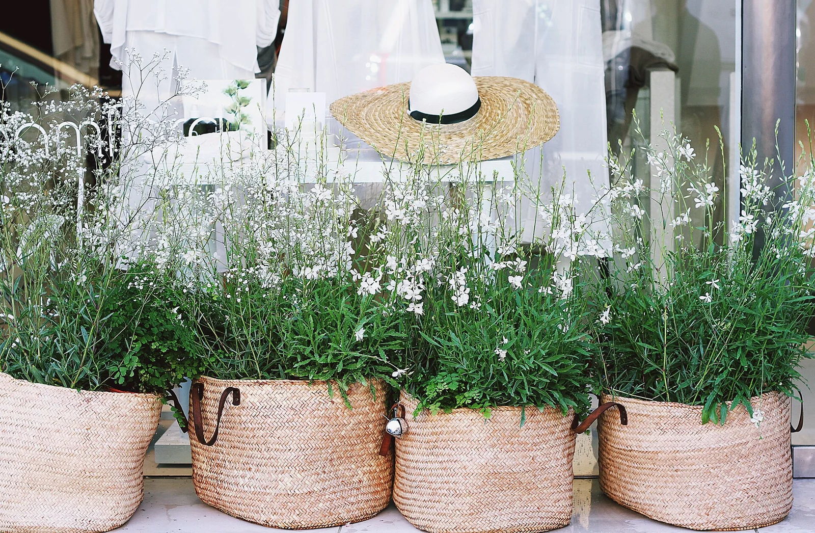
In the first imagined pair, pale flower shapes sit above green foliage. Beneath them is a plain gray container. I read the pot as a relatively quiet lower area, leaving the lighter shapes above to carry much of the interest. The choice is not an assertion that gray disappears in every setting; it describes the relationship I intend in this fictional view.
Now use the same proposed shape and planting appearance with the blue container. I notice two distinct colored areas: the pale flowers above and a more definite blue object below. I enjoy that version when I want the vessel itself to remain part of the display. It is a different intention from choosing a container mainly as a background for the flowers.
Without visible flowers, ask what the blue is doing
For the second view, leave the container choices unchanged and imagine foliage alone above each one. This is a visual alternative, not a prediction that an identified plant will pass through a particular season or lose its flowers. No species, growing conditions or flowering duration has been established.
With the gray pot, my interest stays more with the outline of the foliage. With the blue pot, the lower colored shape remains an obvious part of what I am choosing to display. If I only liked the blue as a companion to the pale flowers, that continuing role might be unwelcome. If I liked the vessel’s presence in its own right, the foliage-only view could confirm the original intention.
Getty describes emphasis as a part of a composition standing out through differences such as color or shape. That vocabulary helps name the proposed role of the container; it does not establish a universal response to blue or a measured attention pattern. Both views are personal visual judgments.
A quieter pot is not a lesser purchase
Imagine Ellis choosing between these two directions. Ellis wants to enjoy the changing appearance above the rim without making the vessel the permanent center of attention. The gray direction may be more suitable for that preference, even if the blue-and-flower photograph initially looks more striking. No one needs to choose the most noticeable object to demonstrate enthusiasm for a garden.
Another fictional buyer, Rowan, enjoys the container as a distinct colored form and wants it to remain visible beside foliage. Rowan has a different reason for considering the blue. These decisions are not a ranking of the buyers’ taste; they depend on whether the continuing role of the pot is actually desired.
Keep the color decision smaller than the gardening decision
For a real container, investigate its actual dimensions, intended use, plant requirements and relevant placement limits separately. The color comparison establishes none of those facts. It does not authorize a load on a balcony, suggest a paint treatment or identify weather resistance from a photograph.
Before paying for a container mainly because of a planted display, consider a second view in which the flowers are not doing that work. If the pot still has the role you want, you have a clearer aesthetic purpose to investigate. If it does not, another suitable container or no new purchase may be the more accurate choice.
Sources & further reading
Published sources for the details and examples discussed in this story.