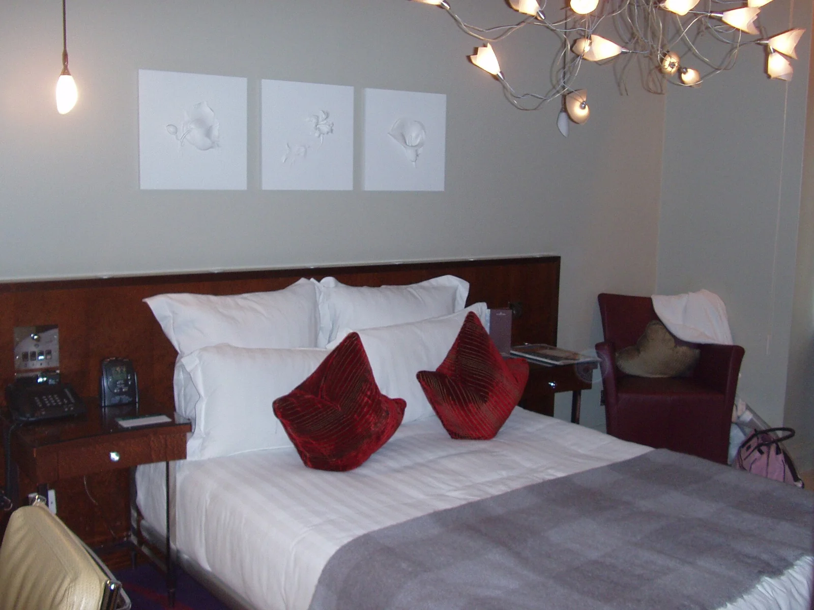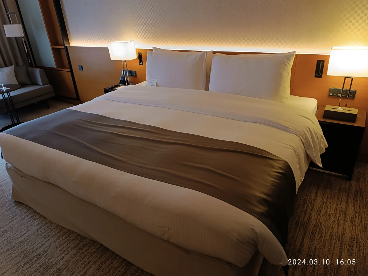
A bedding change can begin with two pillowcases rather than a new duvet set. For this original example, imagine a bed with a plain warm-white duvet cover and two rectangular pillows that the household actually uses. The cover, the pillows and their ordinary positions remain fixed. We compare two proposed pillowcase designs in the same terracotta color family. The question is the visible shape of that color, not how many additional cushions a photograph can accommodate.
A band made from the cases you use
In the first imagined view, both cases are terracotta across their visible fronts. Placed next to each other at the head of the bed, their colored areas make a broadly connected horizontal band above the white cover. The connection is part of this proposed arrangement; an actual gap between pillows, a turned edge or different positions could interrupt it.
I would shortlist this kind of full-front case if I wanted the top of the bed to read as one color area. The two useful pillows do the work. No bolster, additional decorative row or contrasting throw is needed to make the proposal complete. Whether two pillows are the right quantity for another household is outside this invented example.
Two insets instead of one band
For the second view, imagine warm-white cases with a terracotta rectangular inset on each front. The pillows stay where they were. Now the color appears twice, separated by the surrounding pale case areas. The white fronts connect more closely with the retained duvet in the imagined palette, while the terracotta rectangles remain individual shapes.
This option would interest me if I wanted a repeated detail without a full colored strip across the head. It is not simply a smaller version of the first purchase: the case design creates its own edges within each pillow. A narrow stripe, an all-over pattern and a central panel would create different relationships again, so the actual design matters more than finding the right color name alone.
Shortlist by design before adding pieces
Getty's formal-design vocabulary discusses emphasis and the distribution of visual attention. Here that helps describe a preference for a connected band or repeated separate shapes. It is not evidence that terracotta produces a mood, that one design suits every room or that either arrangement changes sleep quality. The two proposals are choices in an imagined bed view.
I would choose the inset cases for this particular plain duvet because I like the pauses between the colored rectangles. That preference narrows a shopping search to the case's front design rather than inviting more bedding layers. Someone wanting a continuous head-of-bed color field would have a different, equally specific shortlist: full-front cases that can make that relationship with their own pillows.
The real cases still have to work
A screen cannot establish that a pale panel matches your existing cover or that two terracotta products match each other. Actual color, pillow dimensions, closures and care need checking for the particular items. This comparison supplies no laundering instruction, material-performance result or tested color match. Keep those practical questions beside the visual intention.
If neither proposed design improves the view for you, keeping the existing cases is an available outcome. The exercise succeeds when it clarifies a wanted relationship, even if that produces no order. The retained duvet and useful pillow count are the starting constraints, not obstacles to be removed by buying an entire photographed display.
Sources & further reading
Published sources for the details and examples discussed in this story.